Zensurance is bringing innovation in the commercial insurance space, you might have heard and read somewhere. If you haven’t, let it be a good starting point to knowing us! Being a UX researcher at Zensurance, I want to share how we make this innovation happen at a granular and day-to-day level. How our decision-making at every step is user-centric, innovative, and intended to improve the processes for our customers.
Last year when I started at Zen, the most common discussion among our stakeholders was how we can make it easier for people to submit the online request for an insurance quote so we can help them take their process forward. Our access points are 100% online and therefore we can’t help a client unless they go through our online quote process and submit a request to get a quote. A lot of customers would go through the questionnaire online and then stop at the last stage of contact details and not submit. Our hypothesis was that sharing personal details is intimidating and not comfortable for everyone. But we wanted to find out the real cause.
We set out to do some UX Research to find answers from business owners in Canada. We talked to potential clients as well as those that dropped off without submitting the online form. These people were from different industries, business backgrounds, age groups, as well as years in business. What we found was that particularly in contact details, sharing the phone number is more problematic than other details. There were multiple reasons to this:
- Customers were afraid they will get scam calls which will be hard to block
- Fear that their information is sold leading to more scam calls or leak of information
- Lack of control on who will get this phone number and choose how they would like to be contacted
- People are busy at times, they can’t pick up calls and don’t want to be surprised
Thing to note here is that finding the root causes doesn’t mean we know how to solve the problem. It means we have a key to many ideas, some ideas might solve the problem better than the others, some may lead to unintended consequences, and some ideas may seem like solutions but don’t address the root causes. For example, talking about security for women, they explain underground train stops do not feel safe at later hours of the day. The solutions can be many!
- have police or guards patrol these train stops
- put posters or information about women’s safety and how to contribute
- put phone booths for people to call at they see something suspicious or unusual
- put blue lights which in many places have resulted in lower crime rates
- let women carry weapons for self protection (well ideas can be absurd too!)
- and many others
Our UX team is very much aware of how doing research can bring us closer to the real root causes, which then means finding appropriate solutions and not stopping there. We take them forward to A/B testing them or going back to the customers with possible solutions (prototypes) to test what works better. This is what I personally love about Zensurance! We experiment over and over, despite disappointments or successes, to really hit the spot where our innovative solutions can actually solve concerns and problems for our customers.
Following our mantra, we brainstormed a couple of solutions together. We do this with various stakeholders; taking in different perspectives. Couple of solutions emerged from this which can be shortlisted to 3 main themes:
- Give customers more control over their choices
- Give more information about why we need the phone number
- Be more transparent about our confidentiality and privacy policies
We decided to go for the 1st option. Under this theme we had a couple of ideas. Giving them the ability to choose the date and time seemed like an obvious option since most companies already do that. No! We wanted to give customers more choice than that so we questioned the very basic ability to decide how they wanted to be contacted without assuming a phone call is the best option for everyone.
Aaaaaand we found our solution in that assumption!
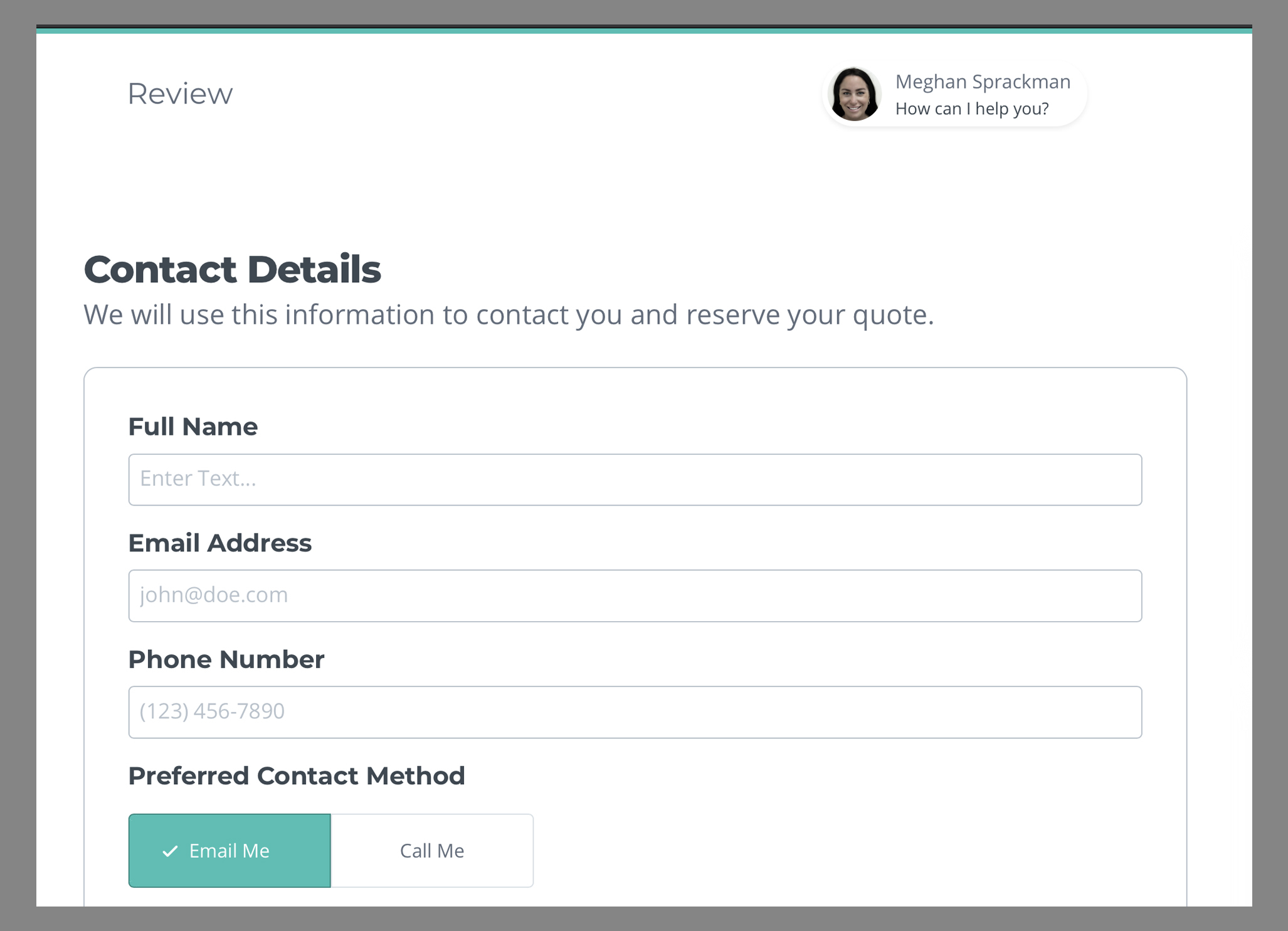
We added a small question for customers: ‘How would you like to be contacted?’ Giving them the option to choose between phone or email. This way we will give customers more control and ensure we have their consent.

Just a small little change that made an incredible difference!
We did an A/B test and compared to our existing page, this new change performed better. It significantly increased the number of people who felt comfortable submitting their form beyond our expectations. This is what user experience does. User experience is not just about the aesthetic value of things, it’s about getting to the root cause of an issue and making a change that will align with the user's needs and behavior.


